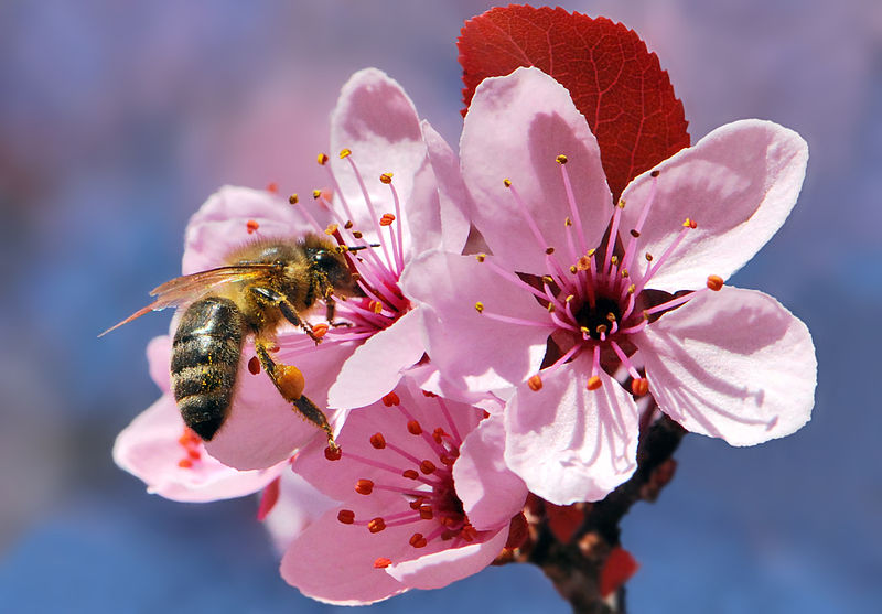
Image credit to Bernie Kohl.
"If the bee disappeared off the face of the earth,
man would only have four years left to live.”
― Maurice Maeterlinck, The Life of the Bee
Image credit to Bernie Kohl.
"If the bee disappeared off the face of the earth,
man would only have four years left to live.”
― Maurice Maeterlinck, The Life of the Bee
You'd have to be living under a rock somewhere to not know that our pollinators are in trouble. While the media has been crucial in spreading awareness, a lot of attention has been focused in areas that make people feel like they're helping, but don't actually help.
The other day, a friend forwarded me a link to a Cheerios campaign to save the bees. As I read it, though, I realized it was just a marketing scheme. They were giving out free packets of wildflower seeds. And while bees face many problems, starving to death in suburbia in the middle of the summer is not one of them.
The problem with campaigns like this is that they confuse the actual, complex problems facing bees with simple slacktivist solutions that make a person feel better without doing anything. (Though I must admit, I did claim my free packet of seeds.)
| A Threat to Bees | Not a Problem |
|---|---|
| Pesticides | Lack of Wildflowers |
| Parasites and Disease | Cell phone signals |
| Monoculture | Not enough Twitter followers |
Many people who claim to hate bees, actually hate wasps.
On the other hand, Wasps are:
Please compare the nightmare beasts below with the fuzzy, cute critters at the bottom:

Image courtesy of Alex Surcica.
Tips for how small actions can help solve big problems.
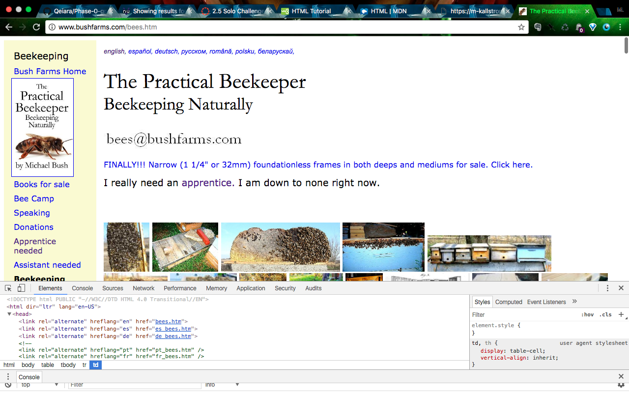
One of the first websites I found while learning about beekeeping was Bush Bees. It has a lot of great content, offering the author's advice and expertise. He does a lot of experimentation on beekeeping methods, which I find fascinating. I admire his commitment to natural and low human-intervention beekeeping.
The layout on the other hand, has always bothered me. Photo thumbnails are crammed onto the page and clicking on one opens the link in the current window. The list of content down the side does allow you to see everything offered, but is too long. Surely there is a better navigation method?
Opening up the Page Source shows a lot more stuff going on than I anticipated. There are a ton of keywords for SEO and a page content summary. The links on the side also are arranged in categories, which I never noticed because I was overwhelmed by the sheer number of links.
It's also fun to see the notes of whoever made the site and was playing with the screen sizing. I had assumed it would be all auto-generated stuff.